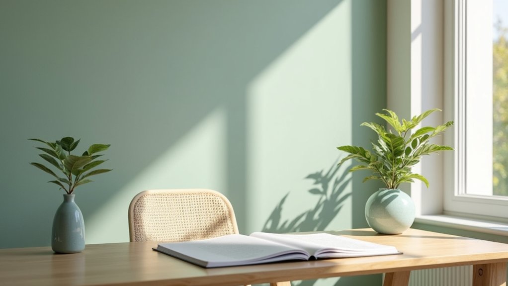
Choosing the right colour can make your productive home office feel calmer, reduce glare, and support sustained focus. Soft blue, sage green, warm grey, and gentle beige work well because they reflect moderate light without creating visual distraction. Your room’s natural light, task demands, and existing materials should guide the final choice. You’ll also need to balance soothing tones with enough contrast and brightness—especially if you want the space to support both concentration and creativity.
Key Takeaways
- Choose soft blue, sage green, warm grey, or beige to create a calm, focused backdrop with minimal visual strain.
- Use muted coral, apricot, or soft golden yellow as small accents to boost mood without causing overstimulation.
- Match colours to natural light: warm tones suit north-facing rooms, while cooler shades balance bright south- or west-facing spaces.
- Prefer matte or low-sheen finishes and test paint samples throughout the day under natural and artificial lighting.
- Balance calm wall colours with warm wood, plants, textured textiles, or limited artwork to add comfort and creativity.
Best Colours for a Calm Home Office
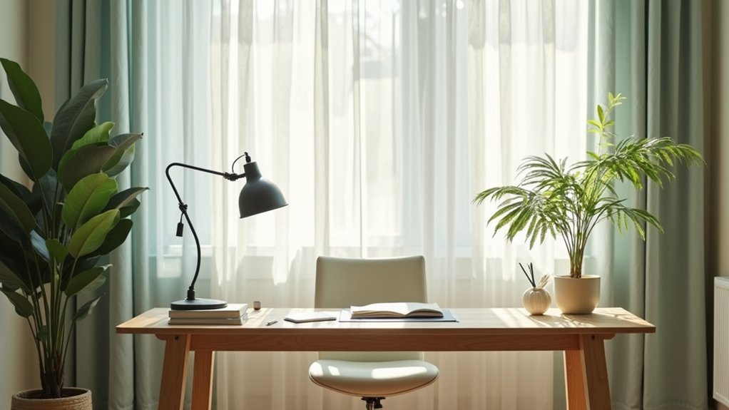
Soft, muted colours can create a calmer home office by reducing visual stimulation and making the space feel more balanced. Choose pale blue, sage green, warm grey, or soft beige for walls and large surfaces. These shades reflect moderate light, reduce glare, and pair easily with natural wood, white, or black furniture.
Test paint samples in morning and afternoon light before committing, because undertones can change the room’s appearance. Consider your personal color preferences when selecting a shade; you’ll maintain the space more consistently when you genuinely like it.
Also account for cultural color meanings, especially if certain colours carry personal or professional significance for you. Use one dominant neutral, one supporting colour, and limited accents to maintain visual order without making the office feel sterile or monotonous.
How Office Colours Affect Focus and Mood
Your colour choices can shape concentration by reducing visual strain and supporting sustained attention. Use calm blues or greens for focus.
Then add measured yellow or warm accents to lift your mood without creating distraction.
Colour and Concentration
Colour can shape how alert, calm, or mentally fatigued you feel during work. Color psychology links saturated, high-contrast surroundings with greater stimulation, while muted, mid-tone colours generally reduce visual strain.
For sustained concentration, choose a restrained palette: soft blue, grey-green, warm white, or light taupe. Use one dominant wall colour, then limit stronger accents to small areas, such as shelving or stationery. This visual hierarchy helps your eyes settle instead of continually scanning competing surfaces.
Consider lighting, too; harsh bulbs can distort colour and increase fatigue, whereas neutral, evenly distributed light supports accurate perception. Aim for visual harmony by coordinating walls, furniture, and screens without making everything identical.
If you notice distraction, reduce contrast, patterns, and reflective finishes first. Your goal isn’t stimulation; it’s a stable environment that supports clear, sustained attention throughout each work session.
Mood-Boosting Hues
To lift mood without undermining concentration, add small amounts of warm, energising colour rather than repainting the room in intense hues. Color psychology suggests muted coral, apricot, or soft golden yellow can create warmth and support mood enhancement when you use them selectively.
Paint one alcove, choose a desk accessory, or hang artwork in a measured shade. Test samples under your office’s natural and artificial light; colours can appear stronger on large surfaces and shift throughout the day.
Balance warm accents with calm neutrals, such as soft white, grey, or pale blue, to prevent visual overstimulation. If you feel tense, reduce saturated reds and oranges, which may increase arousal.
If your room feels flat, introduce colour through textiles or plants, then adjust based on your response.
Productivity Through Colour
A productive office uses colour to shape attention without creating visual strain. Choose soft, low-saturation backgrounds, such as warm white, pale blue, or muted green, to reduce visual noise and support sustained concentration.
Use deeper tones sparingly on one wall or in accessories; they can add visual structure without making the room feel enclosed. If you need energy for creative tasks, introduce small accents of yellow or coral, but avoid highly saturated areas near your screen.
Balance cool colours with natural wood, warm lighting, and textured fabrics to prevent a sterile mood. Personalising decor helps you connect emotionally with the workspace, while incorporating artwork can stimulate ideas when placed outside your direct viewing zone.
Test samples in changing daylight, then adjust colour, contrast, and placement to suit your workload.
Match Your Office Colour to Natural Light
Assess how much natural light your office receives and note whether it’s warm, cool, direct, or filtered.
Then choose complementary colours that balance the light without causing glare or making the room feel dim.
You’ll create a more comfortable workspace by testing paint samples at different times of day.
Assess Your Natural Light
Your office’s natural light should guide its colour palette, because sunlight changes how walls appear throughout the day. Observe the room at morning, midday, and late afternoon, noting which surfaces receive direct sun and which remain shaded. These natural light patterns reveal whether paint may look warmer, cooler, brighter, or duller than expected.
North-facing windows typically provide cooler, steadier light, while south-facing windows add warmth and intensity. East-facing rooms brighten early; west-facing rooms receive stronger, warmer light later. Test paint samples on several walls, then review them under your normal working conditions.
Include artificial lighting effects by checking samples with overhead fixtures, desk lamps, and screens operating. If daylight is limited, choose a lighter, moderately reflective finish to improve visual clarity without creating distracting glare during focused tasks.
Choose Complementary Colours
Once you understand your room’s natural light, choose wall colours that balance rather than compete with it. North-facing rooms receive cool, indirect light, so select warm off-whites, soft greige, or muted peach to prevent a stark, blue cast.
South-facing offices benefit from cooler sage, blue-grey, or balanced white, which temper intense sunlight. In east-facing rooms, warm neutrals support morning brightness; west-facing spaces need softer, cooler tones to offset afternoon glare.
Test samples on each wall, observing them at morning, midday, and late afternoon. Choose a finish with low or mid-sheen to reduce reflections on screens.
Color psychology can guide your final choice: blue-green supports focus, while warm neutrals encourage steadiness. Although interior design trends favour bold accent walls, keep contrast controlled for visual calm and consistent productivity throughout your workday.
Choose Colours for Focus, Creativity, or Calm
Choose a colour based on the type of work you do most: soft blue or muted green can support sustained focus, warm yellow or terracotta can encourage creativity, and gentle neutrals can create a calm backdrop for tasks that require low visual stimulation.
Use Color psychology as a planning tool, not a guarantee; your lighting, screen use, and personal response also matter. Test wall paint options on several areas, observing them in morning, afternoon, and evening light.
Choose medium-value shades with restrained saturation to reduce glare and visual fatigue. If your workload varies, assign one dominant neutral and add removable accents for creative projects.
Keep ceilings and trim lighter to maintain perceived spaciousness. Before painting, sample large boards, position them beside your desk, and assess comfort during a typical work session.
Use Blue Office Colours for Focus
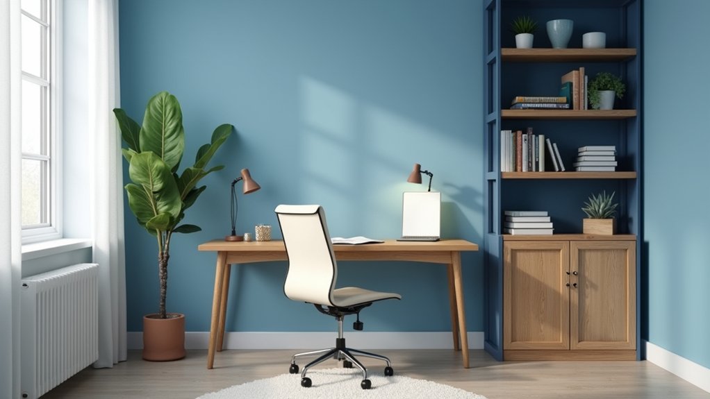
Blue office colours can boost concentration naturally by creating a visually calm work environment. Choose soft, muted blue shades to reduce visual stimulation without making the room feel cold.
Pair blue walls or accents with balanced lighting to support sustained focus.
Boost Concentration Naturally
Soft blue office colours can support concentration by creating a visually calm environment without feeling dull or distracting. Color psychology links blue with mental clarity, steady attention, and lower perceived stress, making it useful for demanding tasks.
Apply it strategically to a feature wall, desk backdrop, or storage units rather than covering every surface. Keep your monitor, desk, and chair positioned to limit glare, since lighting effects can change how blue appears and influence visual comfort.
Use neutral furnishings to maintain contrast and prevent the room from feeling visually flat. Choose matte finishes where possible; they reduce reflections and help you read screens more comfortably.
Pair your colour plan with scheduled breaks, clear task lists, and natural daylight so the space supports concentration without relying on colour alone.
Choose Calming Blue Shades
When you’re selecting blue office colours, start with muted shades such as powder blue, slate, or blue-grey to create a calm backdrop that supports focus. Color psychology links these tones with stability, clarity, and reduced mental stimulation, helping you maintain attention during demanding tasks.
Choose a matte finish to limit glare from windows and screens, and test samples under your office’s natural and artificial lighting before painting.
If your room feels cool or dim, balance blue walls with warm wood, cream textiles, or soft brass accents. Use deeper navy selectively on one wall, shelving, or furniture to add structure without making the space feel heavy.
Your colour’s emotional impact matters, so avoid highly saturated blue if it makes you feel tense or isolated. Pair blue with adjustable task lighting for consistent visual comfort throughout the workday.
Create Calm With Green Office Colours
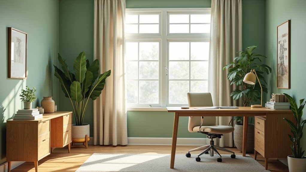
Green can create a calm, focused atmosphere in your home office without making the space feel dull. Choose muted sage, eucalyptus, or soft olive for walls to reduce visual intensity while maintaining energy. Green psychology associates these shades with balance, restoration, and steady attention, making them useful for long work sessions.
If your room receives limited daylight, select a lighter green with moderate saturation so it won’t appear heavy. Test samples beside your desk under morning and evening lighting before committing.
For stronger concentration, pair green walls with crisp white or pale wood-free surfaces, keeping the palette controlled rather than busy. You can also use color therapy principles by introducing green through a desk chair, artwork, or plants.
Keep screens, task lighting, and sightlines clear to support productivity.
Add Comfort With Warm Neutral Tones
Warm neutrals can make your home office feel comfortable and grounded without reducing alertness. Choose soft beige, ivory, taupe, or light clay for walls, then test samples under morning and evening conditions.
Select a finish with low or medium sheen to limit glare on screens while keeping the room easy to maintain. Balance warmer paint with a neutral white ceiling and trim so the space doesn’t look dim or overly yellow.
Add cozy textures through a woven chair, wool-blend rug, or linen desk accessory, but keep surfaces organized to protect focus.
Use ambient lighting with a warm-white temperature around 2700–3000K, positioning a shaded lamp beside or behind your monitor. Layer that light with task lighting, and avoid bulbs that create reflections or harsh contrast across your workspace.
Boost Creativity With Earthy Office Colours
Earthy colours can stimulate creativity while keeping your home office connected to the natural world. Use muted terracotta, olive, clay, or deep ochre on one feature wall to introduce visual energy without overwhelming your concentration.
Color psychology suggests that these grounded hues can support curiosity, warmth, and flexible thinking when you balance them with restrained furnishings. Choose a matte finish to reduce glare and prevent distracting reflections during screen work.
Then add interior accents, such as a rust desk lamp, moss-green organiser, wooden frame, or woven basket, to repeat the palette throughout the room. Keep stronger tones below eye level or behind your monitor so they inspire you without competing for attention.
Test samples under morning and evening lighting before committing, because saturation and surrounding materials can considerably change their perceived intensity.
Brighten Your Workspace With Soft White
If you want a brighter workspace without harsh glare, choose a soft white with warm or neutral undertones for the walls. This finish reflects daylight efficiently while reducing the stark, clinical effect of cool white. Test paint samples beside your windows and under your task lighting, because the color temperature can change throughout the day.
Choose an eggshell or satin sheen for easier cleaning without excessive reflection on screens. Balance the brightness with natural textures, plants, and carefully selected decorative wall accents, such as framed prints or woven panels.
Position your desk perpendicular to the window to limit monitor glare, then complete the setup with ergonomic furniture choices that support proper posture. Use warm, dimmable bulbs so you can adjust visual comfort during focused work, video calls, or evening tasks.
Add Dark Colours Without Losing Focus
Dark colours can add depth and reduce visual distractions when you apply them strategically. Use charcoal, navy, or deep green on one wall, built-in shelving, or a desk backdrop rather than covering the entire room. This creates a visual anchor without making your workspace feel enclosed.
Balance dark accents with soft white walls, light flooring, and reflective surfaces to maintain adequate brightness. Position your darkest elements away from windows if they absorb too much natural light, and check your lighting after sunset.
Choose matte finishes to limit glare on video calls and screens. Consider color psychology: blue-green tones can support calm concentration, while charcoal adds structure and professionalism.
Keep accessories simple, and repeat one dark shade in your chair, storage, or artwork for cohesion.
Frequently Asked Questions
How Can I Test a Paint Colour Before Committing to the Entire Office?
Test paint sample options by brushing two coats on movable boards or several wall sections. Compare them under morning, afternoon, and artificial light, using color testing techniques before choosing your office’s final shade.
Which Finishes Are Easiest to Clean in a Busy Home Office?
You’ll find eggshell and satin finishes easiest to clean; they’re practically indestructible. For Cleaning tips, use mild soap and a soft cloth. Compare Finish durability: satin withstands frequent wiping better, while eggshell hides minor imperfections.
Can Coloured Office Furniture Complement or Clash With My Wall Colour?
Yes, coloured office furniture can complement or clash with your walls. Use Color psychology and furniture coordination: pair warm walls with earthy pieces, cool walls with blue-gray furniture, or create contrast through complementary hues carefully.
How Often Should I Repaint My Home Office?
Repaint your home office every five to seven years; premium paint durability often supports this interval. If scuffs, fading, or moisture appear sooner, act promptly. Use colour psychology to maintain focus, calm, and productivity.
Are Removable Wallpapers Suitable for Changing Office Colour Schemes?
Yes, you can use removable wallpapers to change office colour schemes quickly. Choose temporary wallpaper with repositionable adhesive; peel and stick decor protects walls, minimizes mess, and lets you refresh your workspace without repainting.
Conclusion
Choose a home-office colour that supports how you need to work. Soft blue can sharpen focus, sage green can steady your mood, and warm beige or grey can create a comfortable foundation. Let natural light guide your choice, and test samples before committing. Use soft white to brighten darker rooms, or add deep tones as controlled accents. With balanced colour and suitable lighting, you’ll create a workspace that feels like a quiet anchor for productive days.