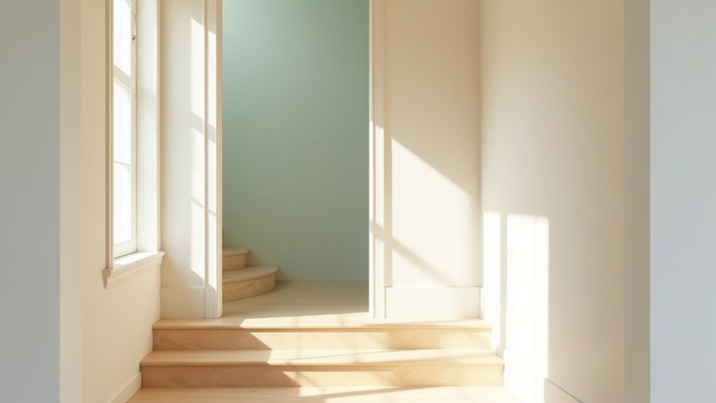
Natural light can make a hallway feel open and safe, yet the wrong colour can create glare, shadows, or a narrow appearance. You’ll get the most balanced result with light neutrals such as soft white, pale gray, or warm beige, then adjust the undertone to suit the hallway’s direction. Consider warmer shades for north-facing spaces and cooler tones for bright, south-facing areas, but test samples on both walls and stairs before choosing—because the best colour may change as the daylight shifts.
Key Takeaways
- Choose light neutrals such as soft white, pale grey, or warm beige to reflect natural light and make hallways feel brighter and more spacious.
- Use warm beige, cream, or golden yellow in north-facing hallways to balance cool, limited daylight without creating excessive glare.
- Select blue, green, or blue-grey for brightly lit hallways to soften intense sunlight and complement cooler natural illumination.
- Use darker shades like charcoal, navy, or forest green sparingly to define architectural features while retaining lighter surrounding surfaces.
- Coordinate wall, stair, trim, and adjoining-room colours, using contrasting treads, risers, and handrails to improve visual clarity and safety.
How Does Natural Light Affect Hallway Colours?
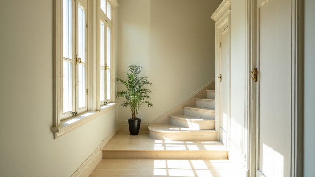
Natural light can change how hallway colours appear throughout the day. Morning light may look cooler, while afternoon sunlight can add warmth, altering how you judge paint undertones and contrast. Observe sample boards at different times, and check them near stairs, corners, and doorways before choosing a finish.
North-facing windows typically provide cooler, steadier light; south-facing windows often intensify warm tones. East- and west-facing light changes more dramatically, so monitor glare and shadow patterns.
Use colour psychology carefully: strong contrasts may improve visual orientation, but overly dark or saturated areas can feel constricted and reduce visibility. Compare daylight with artificial lighting, including fixtures you’ll use at night.
Select consistent bulbs, avoid glare on glossy surfaces, and keep stair edges clearly distinguishable to support safe footing. Overcast conditions can also mute colour intensity.
Choose Light Neutrals for Brighter Hallways
Choose light neutrals to reflect available daylight and make your hallway appear brighter. Use consistent tones on walls and ceilings to create an airy flow between spaces.
Select washable, low-sheen finishes to control glare and maintain safe visibility on stairs.
Maximize Natural Light
Light neutrals—such as soft white, pale gray, and warm beige—reflect more available daylight, helping hallways and stairways feel brighter and easier to navigate.
Choose finishes with a moderate sheen, because they bounce light without creating harsh glare or revealing every surface defect. Test paint samples beside windows and under evening illumination before committing; daylight changes throughout the day.
Coordinate lighting fixtures with the wall colour, selecting warm or neutral bulbs that maintain accurate contrast on steps and landings. Avoid highly polished paint near stairs if reflections obscure nosings or edges.
Instead, use durable eggshell or satin coatings that clean easily and resist scuffs.
Consider flooring textures carefully: low-contrast, matte surfaces reduce glare and provide dependable visual definition.
Keep handrails and step edges visibly distinct from surrounding surfaces.
Create Airy Flow
When you want a hallway or stairway to feel more open, use light neutrals such as soft white, pale gray, or warm beige to reflect available daylight and improve visibility. Choose a paint with a washable, low-sheen finish; it limits glare while helping you spot steps, edges, and obstacles.
Continue the same color through connecting areas to create visual flow, but confirm samples under morning, afternoon, and artificial light. Warm beige can balance cool daylight, while pale gray suits spaces with warmer bulbs.
Keep ceilings and trim lighter to increase perceived height, and avoid high-contrast patterns that can disrupt depth perception. Add decorative wall accents sparingly, ensuring they don’t narrow the passage.
Use statement lighting with diffused bulbs, even spacing, and controls at both stair ends for safer movement.
Use Warm Colours in North-Facing Hallways
In a north-facing hallway, you can use golden yellow tones to offset cool, limited daylight.
Choose warm neutral shades, such as beige or cream, to improve visual comfort without creating glare.
Test samples under the hallway’s actual lighting, and keep stair edges clearly visible for safe movement.
Add Golden Yellow Tones
Golden yellow tones can warm a north-facing hallway, where limited direct sunlight often makes paint colours appear cooler and darker. Choose a light-reflective golden yellow with a balanced undertone, then test a sample on each wall. Check it in morning, afternoon, and artificial light, because LED colour temperature can change its appearance.
Use complementary color schemes carefully: blue or blue-grey accents create contrast, but limit them on narrow stairs to avoid visual busyness. Keep the ceiling lighter to improve perceived height, and reserve stronger yellow for a feature wall or trim.
Before painting, clean surfaces, repair cracks, and use low-VOC products with adequate ventilation. On stairs, select a durable, washable finish with suitable slip-resistant floor coatings; don’t apply glossy paint where glare could obscure tread edges or handrails.
Choose Warm Neutral Shades
Warm neutral shades offer a softer alternative to golden yellow in north-facing hallways, where cool daylight can make surfaces look dull or blue. Choose creamy white, oatmeal, light beige, or muted taupe to add warmth without making the passage feel enclosed.
Before painting, test large sample boards on each wall; daylight changes throughout the day, and artificial bulbs can shift the result. Balancing colour temperature matters: pair warm walls with neutral-white LEDs around 3000–3500K to prevent an overly yellow appearance.
Choosing complementary hues for trim, doors, and stair rails keeps the route visually coherent. Use a washable, low-sheen finish to resist scuffs while limiting glare on steps.
Check colour contrast between treads, risers, and walls, particularly where shadows reduce edge visibility. Keep lighting and handrails unobstructed for safer movement.
Try Cool Colours in Bright Hallways
When bright hallways receive strong natural or artificial light, choose cool colours such as blue, green, or blue-grey to reduce visual glare and create a calmer shift between rooms. Test large samples on each wall, because daylight direction and nearby surfaces can alter the colour’s appearance.
Select a light-reflectance value that preserves visibility without producing harsh brightness, especially near stair edges and landings. Satin or eggshell coatings usually clean more easily than flat paint, but avoid excessive sheen where reflected light could obscure changes in level.
Use bold accent walls sparingly to guide movement without confusing the hallway’s visual path. Textured paint finishes can disguise minor surface defects, yet keep texture subtle so shadows don’t hide scuffs, trim, or handrail fittings.
Coordinate cool tones with consistent lighting and clear safety markings.
Create Contrast With Darker Hallway Shades
For hallways with limited glare, darker shades can create contrast, define architectural edges, and make adjoining rooms feel brighter. Choose deep charcoal, muted navy, or forest green with a light-reflective finish to prevent the passage from feeling enclosed. Before painting, check how daylight changes across the day and test large samples near windows, corners, and stair openings.
Accent wall options include the wall opposite a glazed door, a stair riser section, or a recessed niche; keep walking surfaces visually clear. Use textured paint finishes cautiously, because heavy texture can trap dust and make scuffs harder to clean.
On stairs, maintain strong contrast between walls, treads, and handrails so edges remain visible. Select washable, low-VOC paint, ventilate the area, and use stable access equipment rather than standing on stair treads.
Coordinate Hallway, Stair and Room Colours
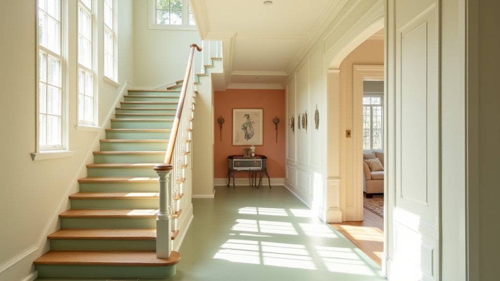
Coordinate hallway, stair, and room colours by repeating one undertone or linking shade across adjoining spaces. Choose warm whites, greige, or soft taupe if your natural light feels cool; select blue-grey or muted green when sunlight appears warm. Test large samples on every wall, because shadows and changing daylight can alter perception.
Use Hallway accent walls selectively, keeping adjacent walls lighter to maintain visual width and improve wayfinding. Carry the accent colour onto a landing or room doorway for continuity, but avoid abrupt changes at stair edges.
Match Staircase railing colours with door hardware or nearby trim, using satin or eggshell finishes that limit glare and reveal damage early. Keep treads, risers, and handrails visually distinct enough to define each step.
Before painting, secure access equipment, protect walking surfaces, and maintain clear routes throughout the work.
Frequently Asked Questions
What Finish Is Most Durable for High-Traffic Hallways and Staircases?
Choose a washable, low-sheen satin or eggshell finish for high-traffic hallways and staircases. It resists scuffs, cleans easily, reduces glare, and supports lighting considerations; color psychology still guides your chosen shade safely.
How Should I Prepare Hallway Walls Before Applying Paint?
Prepare hallway walls by cleaning dust and grease, scraping loose paint, filling holes, and sanding smooth. Use wall prep and priming techniques: spot-prime repairs, ventilate well, protect floors, and wear eye protection.
What Paint Colour Works Best for Hiding Scuffs and Marks?
Choose a mid-tone greige, taupe, or muted blue-gray to disguise scuffs and marks. Your wall texture and paint sheen matter: use eggshell for washable durability, and test samples under your hallway’s lighting.
How Can I Test Hallway Paint Colours Before Committing?
You’ll see colours reveal themselves like shifting weather. Use color testing techniques: apply sample paint application on large boards, move them around, and inspect morning, afternoon, and evening. Don’t judge from tiny swatches alone; protect floors.
Which Tools Make Painting Stairwells and Narrow Hallways Easier?
Use an extension pole, angled brush, mini-roller, edging tool, and sturdy platform ladder. Apply safe Painting techniques, while Colour psychology guides choices. Wear goggles, ventilate well, secure ladders, and protect floors before starting.
Conclusion
With natural light, you can make hallways and stairs feel open, safe, and cohesive. Choose soft white, pale gray, or warm beige to reflect daylight; use warmer tones to balance northern exposure and cooler hues in bright, southern spaces. For definition, pair light walls with darker trim or stair elements, but maintain clear edge contrast. Test samples throughout the day, coordinate adjoining rooms, and avoid glare-producing finishes so your colour scheme supports both visual comfort and secure movement.