

You can give your guest bedroom a gentle refresh by choosing a warm, balanced colour palette. Start with muted terracotta, soft ochre, warm beige, or dusty peach, then consider how natural light changes each shade throughout the day. Soft neutrals, earthy tones, timber, rattan, and woven fabrics can add comfort without making the room feel heavy. The right base colour matters, but the finishing accents often determine whether the space feels genuinely welcoming.
Key Takeaways
- Choose muted terracotta, soft ochre, warm beige, or dusty peach to create a comfortable, welcoming guest bedroom.
- Assess natural light throughout the day, then test large colour samples under both daylight and artificial lighting.
- Use warm whites, greige, pale taupe, oatmeal, or muted beige for a calm, versatile neutral foundation.
- Add earthy tones such as clay, olive, ochre, or muted rust through feature walls, headboards, linens, or accessories.
- Introduce gentle colour with dusty rose, pale peach, soft sage, or powder blue in bedding, artwork, and decorative accents.
Choose Warm Guest Bedroom Colours

Warm guest bedroom colours create a welcoming atmosphere without making the room feel enclosed. Choose a base shade such as muted terracotta, soft ochre, warm beige, or dusty peach to establish visual comfort.
In guest bedroom colour psychology, these hues can encourage relaxation, sociability, and a sense of security. Limit saturation on large surfaces so the scheme remains restful rather than stimulating.
Apply the main colour to walls, then repeat it selectively in bedding, curtains, or an upholstered headboard for cohesion.
When incorporating bold accent colours, use a controlled ratio: roughly 10 percent of the room’s visible palette. Try rust cushions, mustard artwork, or deep coral accessories against a restrained backdrop.
Pair warm colours with natural wood, woven textures, and matte finishes to reinforce comfort.
Keep each element coordinated, so guests experience warmth without visual clutter.
Check Your Room’s Natural Light
Before choosing a final palette, observe how your guest bedroom’s natural light changes throughout the day. Note the direction and size of each window, nearby buildings, trees, and exterior surfaces that may reflect or block sunlight.
East-facing windows deliver bright, warm light in the morning, while west-facing windows create stronger, warmer glare later. North-facing rooms usually receive cooler, consistent illumination; south-facing rooms often get longer, brighter exposure, depending on your hemisphere and shading.
These room orientation considerations affect how wall colours appear at dawn, midday, and evening. Test large painted samples on multiple walls, then inspect them under natural and artificial light.
Record the natural light impact at different times, especially when guests will use the room. Check curtains, blinds, and seasonal changes before finalising.
Explore Soft Neutral Guest Bedroom Colours
Soft neutral colours—such as warm white, greige, pale taupe, oatmeal, and muted beige—create a calm guest bedroom without making it feel stark. Choose a wall colour with a light-reflectance value suited to your room’s daylight; warmer undertones can prevent a north-facing space from feeling cold.
Test large painted samples beside the headboard, flooring, and trim, because surrounding finishes can alter perceived colour. Keep the ceiling one shade lighter to increase visual height, and use a slightly deeper neutral on one upholstered surface for definition.
Layer texture through luxury bedding, woven curtains, and a low-pile rug rather than relying on strong contrast. Select decorative lighting with warm-white bulbs around 2700–3000K, ensuring the neutral palette remains inviting after sunset.
Finish with crisp, coordinated accessories.
Add Earthy Tones for Natural Warmth
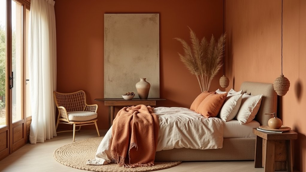
Introduce earthy tones through terracotta, clay, olive, ochre, or muted rust to add natural warmth without disrupting a neutral guest-bedroom scheme. Choose one dominant shade for a feature wall, upholstered headboard, or bed linen, then repeat it in smaller accents for visual continuity. Keep undertones consistent: pair warm beige with clay and ochre, or combine greige with olive and muted rust.
Test samples beside the room’s daylight and artificial lighting, because earthy pigments can shift markedly. Select Eco friendly paint options with low or zero VOCs to support healthier indoor air.
Balance colour with timber, rattan, wool, or linen textures, avoiding excessive pattern. Add Sustainable decor accessories, such as reclaimed-wood trays or woven baskets, to reinforce the natural palette while preserving practical storage and guest comfort.
Try Muted Pastels for Gentle Colour
Use soft blush tones on walls or textiles to introduce warmth without overpowering the room.
Add pale sage accents through cushions, curtains, or foliage-inspired artwork for subtle contrast.
Layer powder blue in bedding and throws to balance the palette and create a calm, coordinated guest bedroom.
Soft Blush Tones
Muted blush, dusty rose, and pale peach create a gentle guest-bedroom palette without the intensity of saturated pink. Choose a warm blush for walls, then test samples under morning, afternoon, and artificial light; undertones can shift noticeably.
Use an eggshell finish to reflect soft light while hiding minor surface imperfections. Balance the colour with ivory bedding, natural timber, or warm metallic details, keeping contrast moderate for soothing aesthetics.
For a romantic ambiance, select dusty-rose cushions or a quilt rather than coating every surface. Pale peach works effectively on one accent wall or inside recessed shelving, where it adds warmth without overwhelming compact rooms.
Check the palette against flooring and window treatments before purchasing. You’ll create a welcoming scheme that feels calm, coordinated, and comfortable for guests throughout the night.
Pale Sage Accents
Pale sage offers a cooler alternative to blush while retaining the softness of a muted pastel. Use it on an accent wall, upholstered headboard, or linen cushions to introduce colour without overwhelming your guest bedroom.
For balanced sage green decor, pair this tone with warm white, light oak, and natural woven textures. Choose finishes with similar low saturation so the palette remains cohesive rather than visually busy.
You can repeat sage in two or three small details, such as a throw, ceramic lamp base, or framed botanical print, to create continuity.
If the room receives limited daylight, select a sage with yellow undertones; brighter spaces can handle a greyer variation.
Keep larger surfaces neutral, then add calming accent shades through accessories you can easily replace. This approach feels restful, adaptable, and welcoming.
Powder Blue Layers
Powder blue layers introduce gentle colour while keeping a guest bedroom light and composed. Choose a blue with muted grey undertones to prevent the room from feeling overly sweet or cold. Apply it to walls in a matte or eggshell finish, depending on your cleaning needs; these soothing paint finishes diffuse light and conceal minor surface flaws.
Add depth with crisp white trim, oatmeal bedding, and washed-blue cushions. You can anchor the palette with pale oak furniture or woven rattan, which introduce warmth without competing with the pastel.
For calming colour combinations, pair powder blue with soft sage, dusty lavender, or warm blush in small, repeatable accents. Check samples in morning and evening light, then adjust bulb temperature so the blue remains balanced after sunset.
Keep patterns fine-scaled for a restful, flexible scheme.
Add Rich Accents in Small Doses
Use rich accents sparingly to give a guest bedroom depth without overwhelming its base palette. Start with one dominant accent colour, such as burgundy, forest green, or navy, then repeat it across two or three small elements.
Introduce luxury velvet accents through a lumbar cushion, upholstered bench, or compact throw. Velvet’s light-reflective pile adds saturation and tactile warmth without requiring large colour blocks. Balance these pieces with neutral bedding and pale walls to preserve visual calm.
Add metallic decorative details in a consistent finish, such as aged brass lamps, bronze frames, or brushed-gold hardware. Limit metallics to selected surfaces, because excessive shine can feel cold or cluttered.
Check the palette in daylight and lamplight, and adjust accent intensity so guests experience contrast, comfort, and cohesion.
Frequently Asked Questions
Can Warm Colours Make a Small Guest Bedroom Feel Cramped?
Yes, warm colours can make a small guest bedroom feel cramped, especially in saturated shades. Use lighter tints, reflective finishes, and balanced furniture coordination; Color psychology suggests softer warmth preserves comfort without visually shrinking space.
Which Paint Finishes Work Best for Guest Bedroom Walls?
Choose eggshell or satin finishes for guest bedroom walls: they balance soft light reflection, washable maintenance, and paint durability considerations. Evaluate wall texture options first, since satin highlights imperfections more than eggshell, especially on uneven surfaces.
How Can You Coordinate Bedding With a Warm Bedroom Colour Palette?
You’ll coordinate bedding by matching undertones, like sunset meeting sand: choose neutral sheets, repeat wall hues subtly, then add Complementary accent pillows and Layered bedding textures for dimension, comfort, and controlled visual contrast.
Should Guest Bedroom Ceilings Match the Wall Colour?
You don’t need matching ceilings; choose Ceiling paint options one shade lighter for spaciousness, or match walls for intimacy. Add Decorative ceiling accents, such as beams or moulding, when architectural detail supports your guest room’s design.
How Often Should You Refresh a Guest Bedroom’s Colour Scheme?
Refresh your guest bedroom’s colour scheme every three to five years; 60% of designers recommend seasonal updates. Match changes to your decorating style, evaluating fading, trends, lighting, and guest feedback before repainting walls or accents.
Conclusion
With the right guest-bedroom palette, you can create warmth without making the room feel dark or dated. Start with natural light, then layer warm beige, muted terracotta, soft ochre, or dusty peach with timber, rattan, and woven textiles. If you worry that colour will overwhelm a small space, keep walls softly neutral and introduce richer shades through cushions, throws, artwork, or lampshades. Finally, use warm LED lighting to reinforce the colour scheme and make guests feel comfortable.